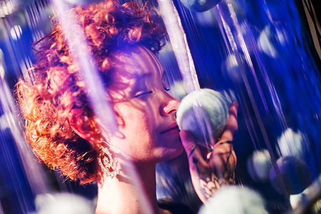
A visitor interacts with Snow Storm, a special commission by Christopher Brosius. (Scott Rudd )
By Matthew Mallary
“The Senses: Design Beyond Vision” is not afraid to push the boundaries of what an interactive museum exhibition should be. Only one step into the Cooper Hewitt exhibit on the third floor of the ornate and regal mansion you realize that this is no ordinary installation. The exhibit uses the senses to conjure feelings or reactions from the observer. Eschewing more conventional means of display, artists use parabolic speakers, air, scents, and other means to convey their messages.
The Senses revolves around the most basic of our animal brains, yet tries to pair an emotional component to what might be smelled, touched, heard, seen. The designers charged with creating the interactive elements, attempt to show how sensory design can play a role in improving the lives of those who struggle with sensory issues.
The first works that grab your attention are six white pillars, arranged in a row, and glowing in color from tranquil light greens, to deep, fiery oranges. Inscribed on the top of the pillars are quotes that encapsulate a feeling, such as “a moment of collective déjà vu.” A button on the side of the pillar, when pressed, releases a scent that was interpreted by several museum attendees as, “cinnamon,” “French toast,” and “a warm breakfast.”

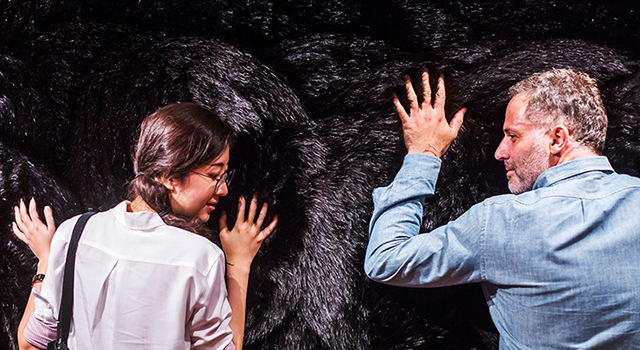
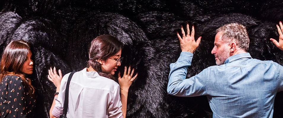
Visitors interact with the Tactile Orchestra, created by Studio Roos Meerman and KunstLAB Arnhem. (Scott Rudd)
One of the larger exhibits appears to be a wall of fur at first glance. It turned out to be one of the more intriguing uses of the senses. When touched at either the top or the base of the wall, sounds of an orchestra would play from a hidden speaker. The pitch and tone of the instruments changed based on where one touched the wall. This encourages visitors to connect touch with sound, and how those two concepts can play off each other.
“The Senses” also subtly combines science and art, with an installation that seemed to just be a metal bowl with feathers flying around it. The feathers fly haphazardly around, begin to descend, but at the last minute are picked up by an intricate design example of aerodynamics.
“Design is typically a medium that focuses on sight and observational skill, the difference in this exhibit is that you can interact with the artwork in a way that you couldn’t before,” said Mia, a graphic design student visiting the site from Maine.

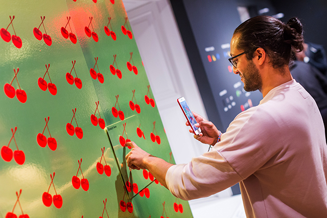
A visitor interacts with the Cherry Forever Sidewall, by Michael Angelo for Flavor Paper. (Scott Rudd)
Museums generally instruct visitors not to touch the priceless paintings or sculptures, however at the Cooper-Hewitt, this is not the case. “Design is the modern form of classic art and interactive exhibits are the perfect example of that, because we live in an interactive generation,” said Mia. “Being able to interact with the artwork in exhibitions such as these, give people that opportunity.”


